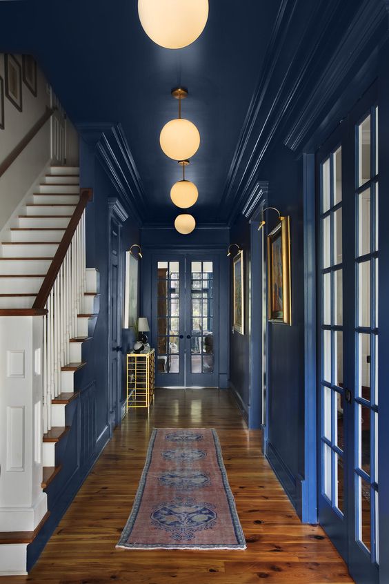
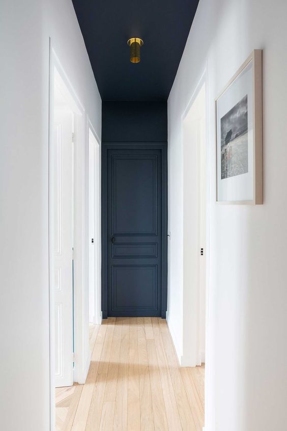
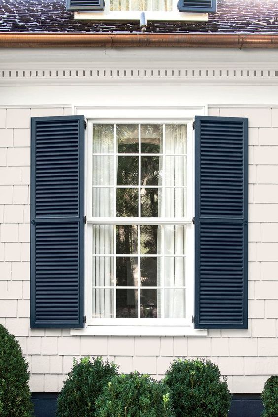
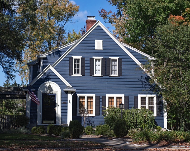
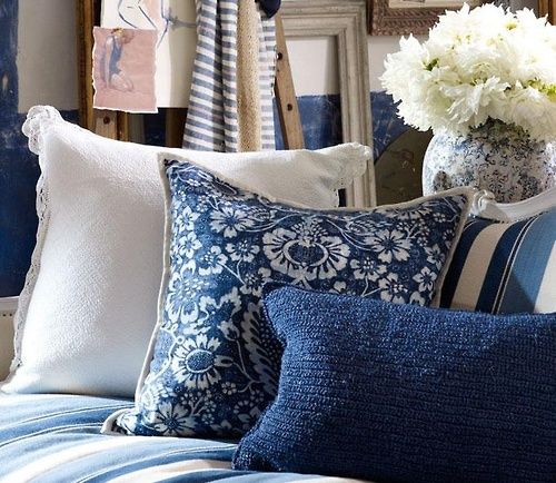
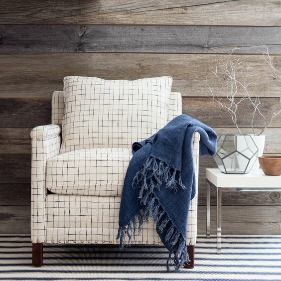
Every year, the masters at Pantone announce the color that they believe reflects the tone of the coming year. This year, they’ve chosen Classic Blue, a true blue that calms the mind and anchors us in this new decade.
A timeless and resistant blue shade, Pantone Classic Blue 19-4052 is elegant in its simplicity. Remembering the evening sky at dusk, with its confident and empathetic messages with notes of nostalgia and elegance. A color that anchors any color palette, that conveys versatility and individuality as it allows it to be worked through textures, diverse finishes and shiny finish, in addition to being a very easy color to match.
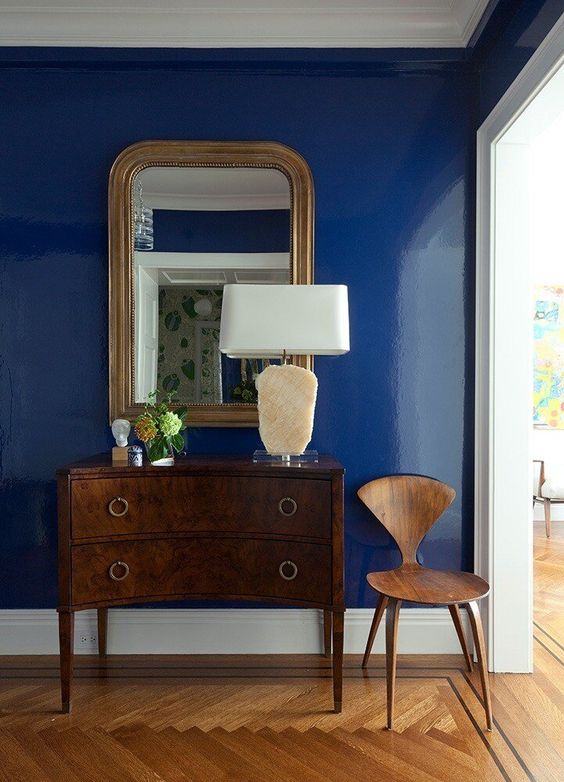
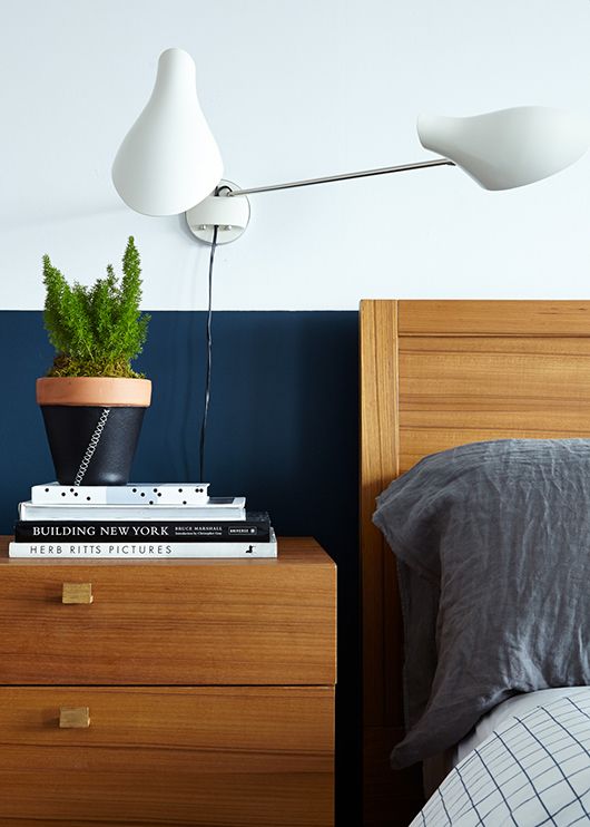
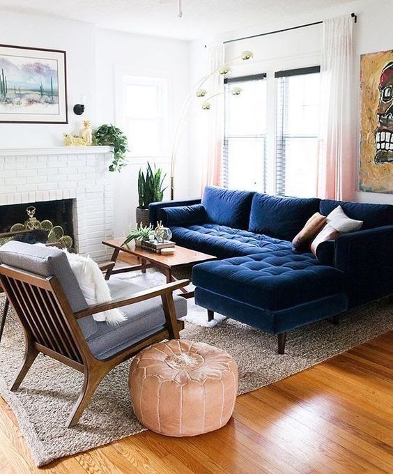
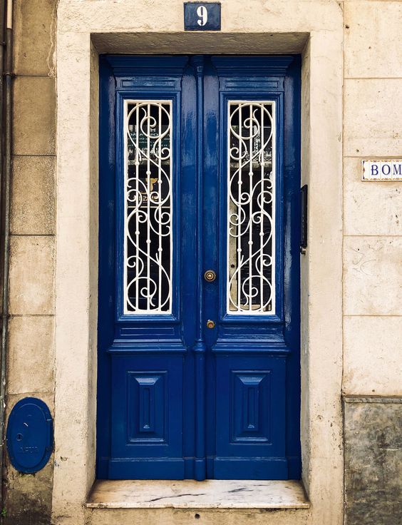
A limitless blue because it evokes the vast and infinite night sky, and inspires us to try looking beyond the obvious, encouraging us to expand our thinking, challenging us in deeper dives, increasing our perspective, opening the channel of communication.
Through a multisensory experience with color 2020, we can bring the true meaning of Classic Blue to life, unifying its users so that everyone has an experience according to their own abilities.
This is why Pantone chose this year to make this Color of the Year the first fully multi-sensory experience in the history of this company. Although the 2020 choice is undeniably easy to implement in any space, I would suggest to use it carefully, always combined with neutral elements such as beige colors, wooden surfaces or green foliage.
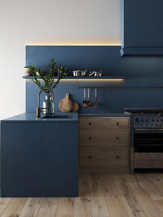
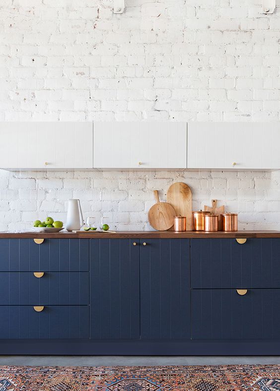
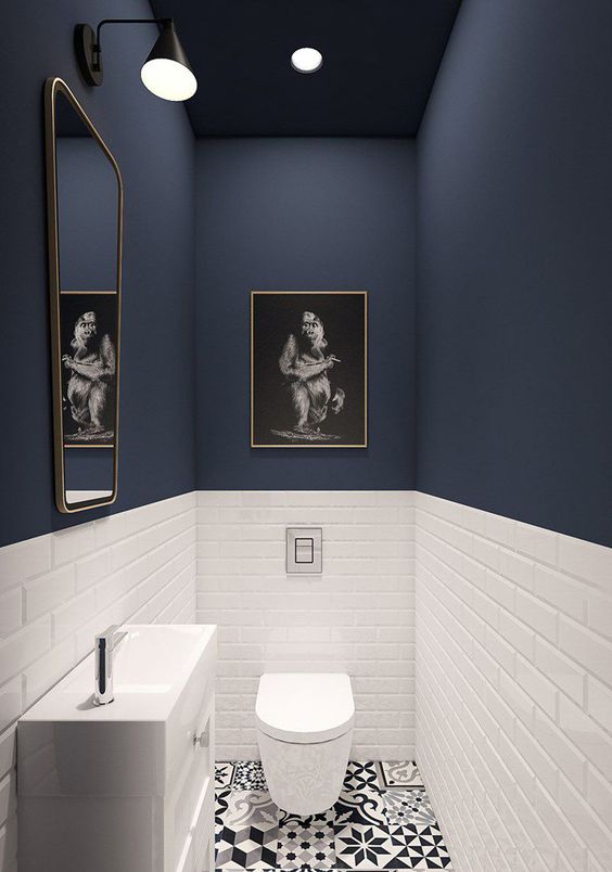
It is not difficult to like and use this Classic Blue choice from Pantone 2020, just use your imagination and explore the possilities.
If you liked this post, please leave your comments below. And remember to subscribe.
See you soon!!


