I’m not here intended to long lecture about colours and how they influence our day by a day mood, but I want to put some highlights on the way we respond to the colours on our daily life, sometimes without even noticing. I won’t focus on marketing products or out doors, tv commercials or fashion design. My point is to show how we can use and abuse of colours in our house, and in which situations the colours can benefit us.
First the primary colours:
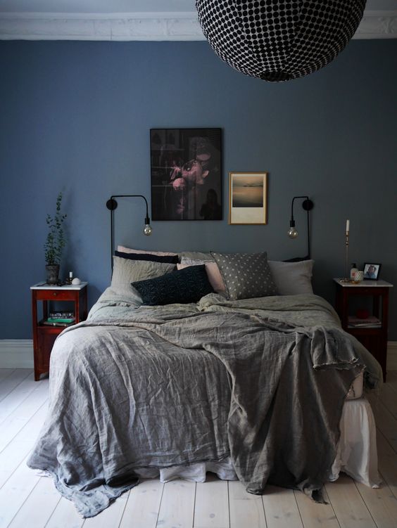
1. Blue: It is the colour that 2/3 of the people in the word likes best and its for sure the most accepted and used in all cultures. Maybe because is the colour of the sky and water refletes the sea, it is the colour of our planet. On walls can be used since the light blue sky tone until the dark night ones. It gives calm, peace, rest feeling, good thoughts, confidence, inspiration. Its the colour of loyalty and devotion, friendship and empathy. Many hospitals use different tones of blue to paint walls in bedrooms and corridors. Its a cold colour so its connected to intelligence, patience and harmony. It can be used like a second colour, matching very well with beige, grey and orange. If used on details, the soft blue evokes tenderness, if darker can suggest sophistication. The brighter tones reminds us vintage uses, such as turquoise. Problems to sleep? Try blue in bedroom…
2. Red: It’s the most emotional and vibrant colour that will for sure provoke energy, passion, lust, erotism, attention and romance. Should be used very carefully or can be considered cheap and vulgar. Designers likes to use this vibrant colour in some objects, matching with modern ambients, but only on key points, contrasting with more neutral settings. Dark and smokey reds are sophisticated and luxurious.

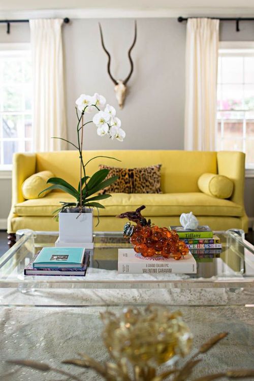
3. Yellow: Stimulates mental activity, attention. Encourages intelligence, cooperation, happiness, energy, joy, optimism, stimulates memory. Its the colour of the philosophy and the wisdom. The pure colour has to be used with care, but in soft versions can cover walls with distinction and warmth. In stores and restaurants its common used with great success cause its linked to food and the desire for it. Summer feeling if used on details and on flowers. Freshness and happiness. Can be successfully used on ambients for older people to stimulate memory and happiness.
Then the secondary ones:
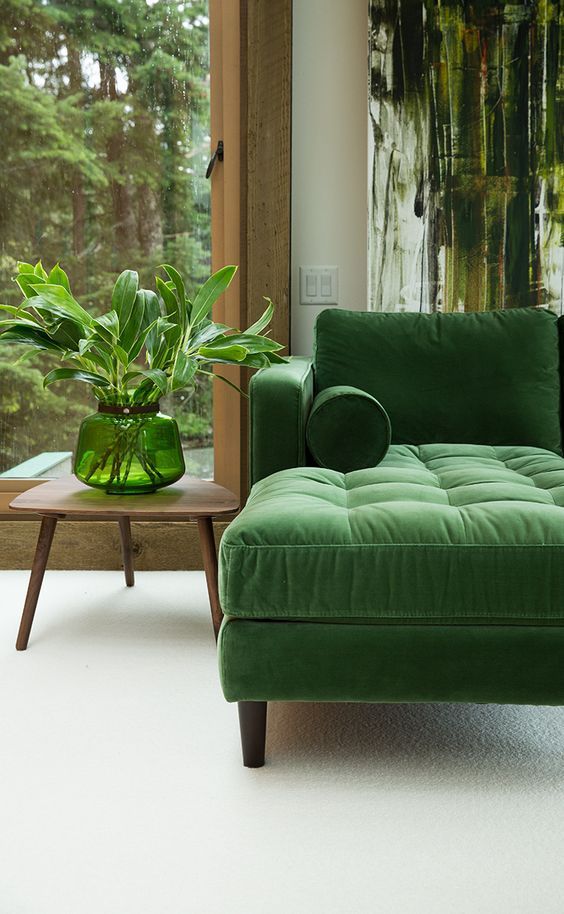
1. Green: Fresh and nature, its connected with the feelings of youth, hope, security and stability, cure, health, fertility, growth, good luck, vitality. Its common used on hospitals and schools on different tones, most of them intending to bring calm and nice behavior. There are innumerable tones of green, many of them coming to the year palete for several times. Can be used in all the rooms, and the dark tones are distinct and royal. Many fabrics use nature inspiration to set in different landscapes.
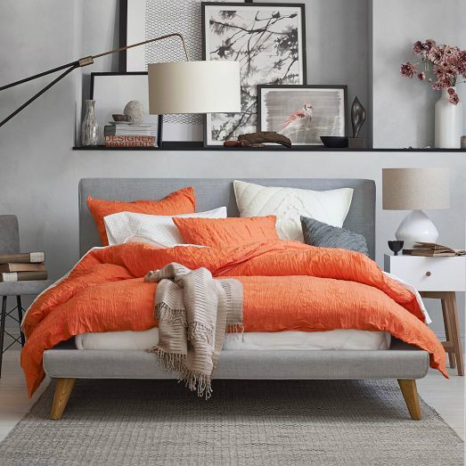
2. Orange: Underestimated as colour. Is stimulating and intense. Very common used in restaurants and bars since its closely connected to food and appetite. Friendly, vital, warm, joyful, energetic. Fresh and invigorating but has to be used with care, just like the yellow, on details and objects. Exciting. Still in combination with other neutral colours, like grey and brown. Want to have a bust in any ambient? Try orange..
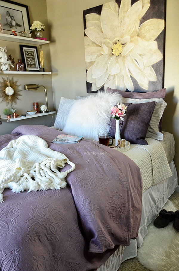
Violet: Appreciated by the teenagers over all the other colours. Can be used in combination to other neutral colours like gray and black. Its intense, espiritual, noble, magic, outrageous. Expresses dignity, mystery, creativity, transformation, arrogance, ego, luxury. Imagination, fame and power. There are different tones from the ones with more red inside (warmer) to the blue (colder), and can be used on details and on extended settings. Can give a twist in any interior set.
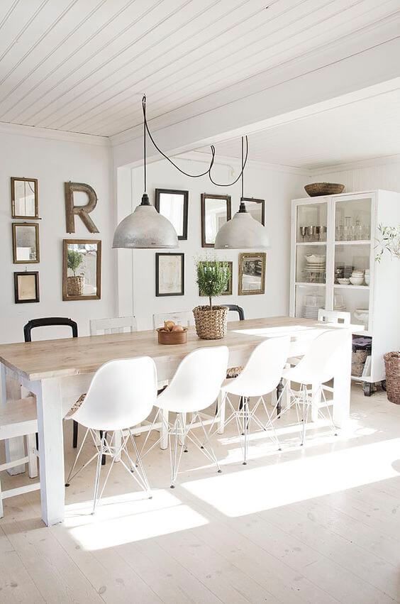
4. White: Innocence, purity, perfection, cleaning, sterilised, illuminated, empty. Use of white on walls can be considered lack of imagination, but intentionally used can show some clean space for designed and important pieces. Always like a blank stage where should be part of a special act. Many off-whites tones are available on the market now, and easy to combine with greys, beiges and browns.
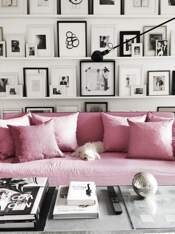
5. Rose-coloured: Sweet, delicate, romantic, soft erotic, tenderness, illusions, charming, amenity, innocence. Can be used on walls, fabrics, materials, clothes, objects, flowers. Its a colour that comes and goes in the market in waves, in different tones. Currently is used combined to beiges, which creates a vintage atmosphere. Or with brown or black to get contrast and modernity…
6. Nut-brown: Neutral, cozy, welcoming, homemade feeling, comfort, stability, simplicity, connected to nature, soil, longevity, generosity. Its perfect combination to almost all the other colours as blue, green, orange and black. It’s a secure starting point for an interior creation. Or becoming the result itself. Timeless.

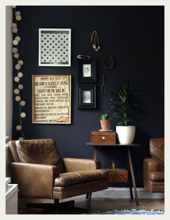
7. Black: Mysterious and dramatic, seductive and sensual, elegant and sophisticated. Don’t be afraid of using larges proportions of this colour if you want to create a really dramatic scenery. Combined with right lighting it can reach marvellous results. It is necessary to create some contrastes here and there, in objects and pictures, to have interesting points to attract the eyes.
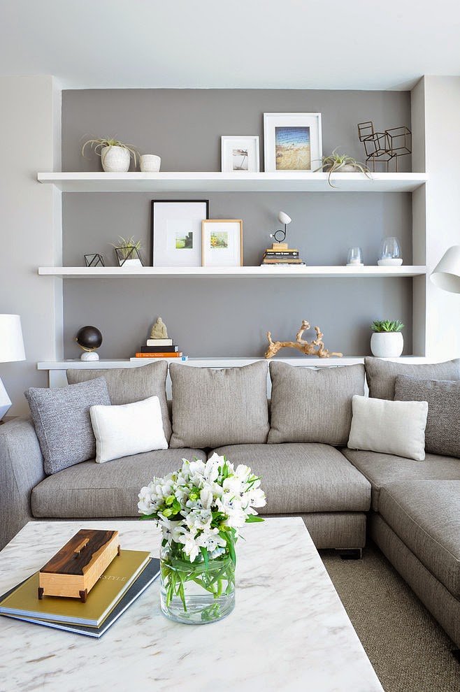
8. Grey: Its unpretentious, cold, and modest. Neutral, with a lot of different tones which alone can create an ambient, or several, with enough structure to stand it by itself. Can be combined with almost all the other colours, including browns and beiges. Perfect base point for creating interesting settings. Boring? Not at all…
Now that you know a little bit about the influence from the colours on our daily life, you can use different tones to create warmth, calm, creative or sophisticated ambients.
If you liked this article, please let your comments below.
See you soon!!


