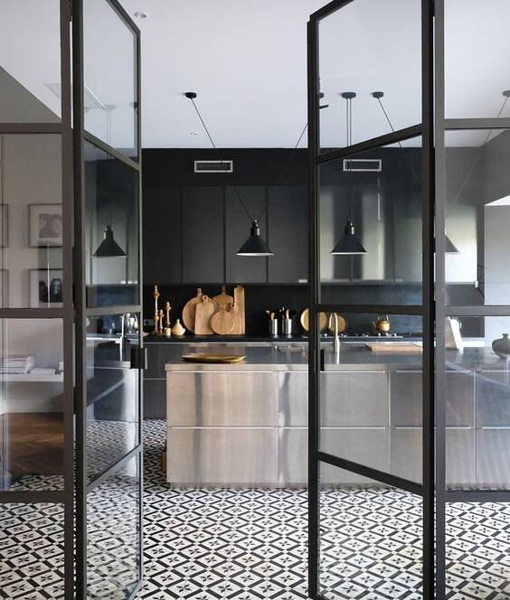
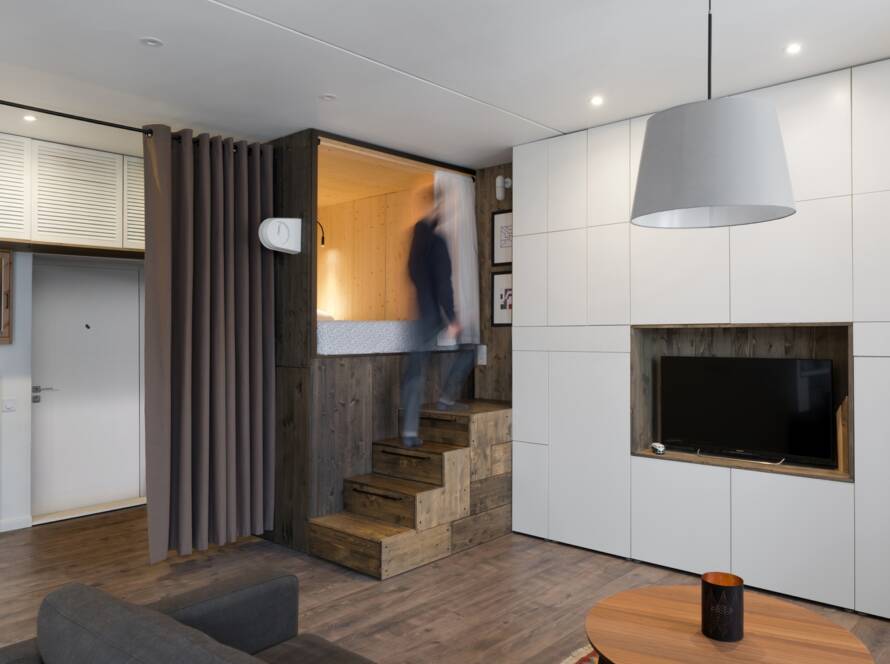
In the beginning of the year Pantone announced their 2017 color of the year.
This palette is used for several branches of activities and helps to guide numerous fabricants to create products that allows us to make combinations of almost everything in any material we can imagine. Lets give a look on some of these colours.
1. Greenery. As I’ve always mentioned, I’m not a huge fan of this shade. Greenery is a mix between lime and apple green, “a zesty yellow-green shade that is supposed to evoke the first days of Spring”. It is not the easiest shade to work with. But you know I love challenges, so I challenged myself to find interiors and images that make me embrace the Greenery palette. Here you go.
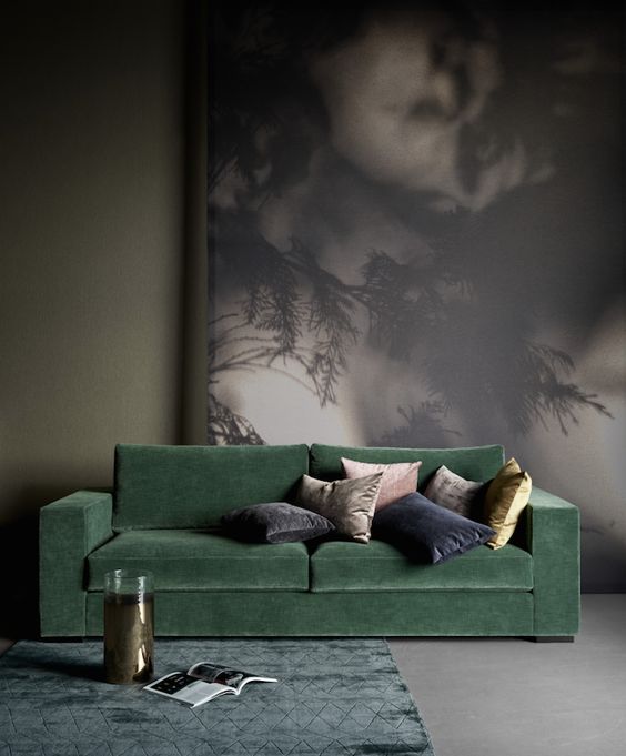
Beautiful green tone in this velvet sofa. 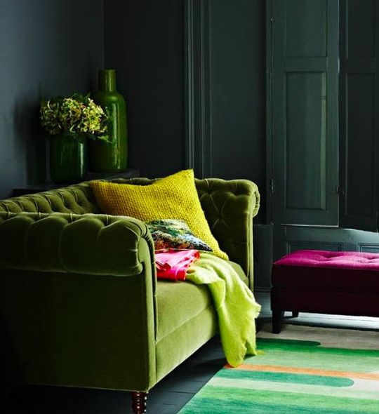
Almost green leaf in a classic model of velvet sofa. 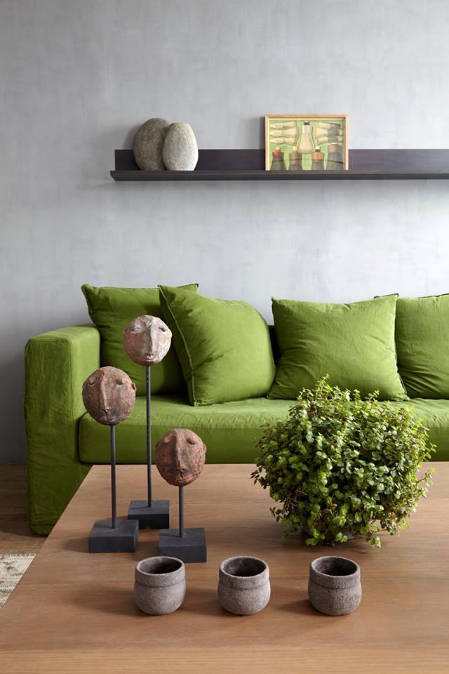
Green sofa combined with a soft grey wall, very actual. 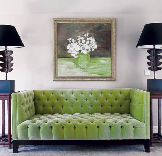
Delicious statement colour this green velvet on a modern lines sofa. 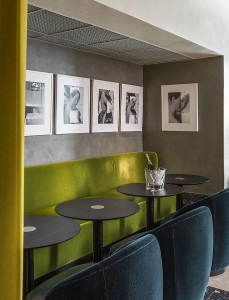
Green and blue combination on a restaurant table sits. 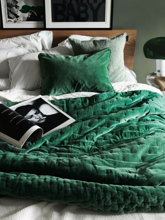
This is a deep green colour, difficult to match, try to use with neutral colours.
2. Blueish. As you noticed, the combination between green and blue is very trendy and can come to different effects. Paint is the easiest and fastest way to completely makeover your space. It can be done over a weekend and the results are often pin-worthy. There’s actually nothing like the sense of accomplishment you feel after taking one of theses projects on. How about including some blue painting in combination with green details, to push up your home to another fashion level?
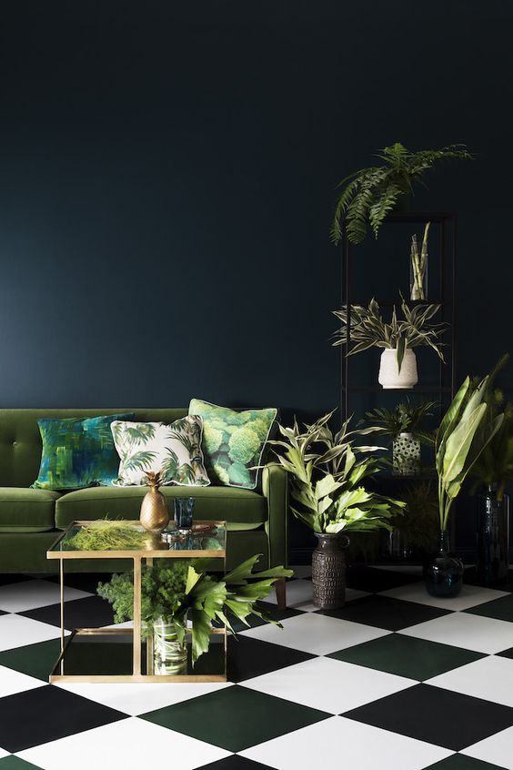
1What can I say, perfect combination between the deep blue wall, the green sofa and the b&w floor. 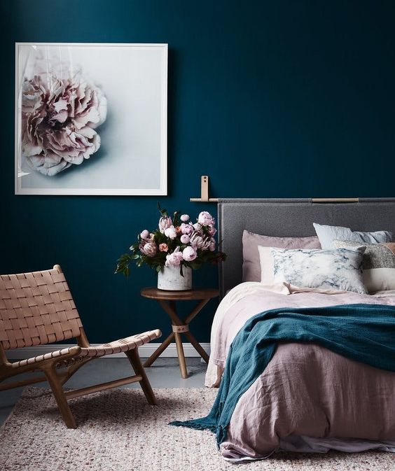
Beautiful blue paint contrasting with rose and grey details. 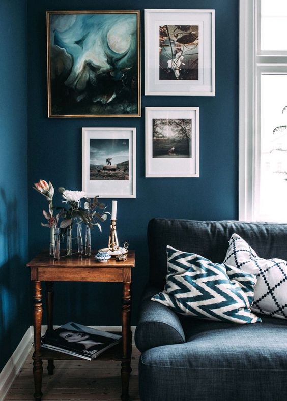
Blue over blue, fantastic.
3. Soft Rose. Not bubble gum rose or pink rose, just a soft splash of an old dusky-pinky colour scheme. Soft charcoals and pretty pastel pinks naturally work well together but the trick is getting the balance right. A grown-up grey will add update a room, but craves pink tones to give it a warm and airy lift. From perfectly balanced bedrooms to chic living spaces and hallways in dire need of an update, this colour combination is the perfect blend of feminine and sleek.

Im simply in love with this rose colour, its so sophisticated. 
Soft rose combined with neutral colours, grey and beige. 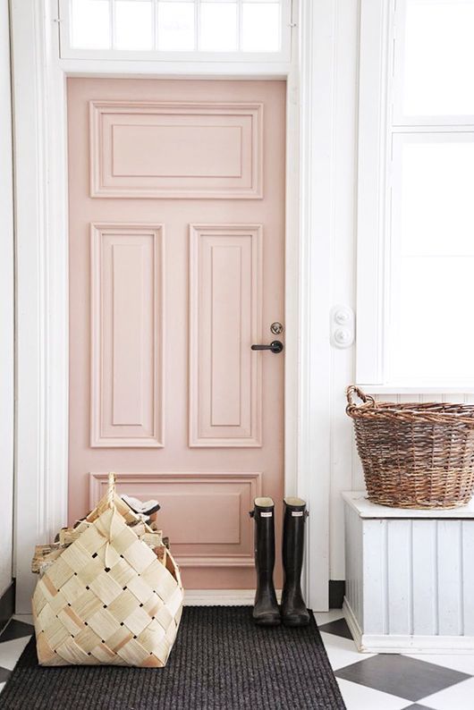
Can be a door be more sexy than this? 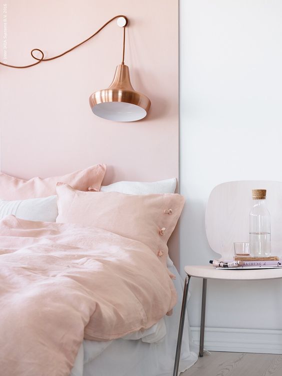
You can find a lot of copper objects now, lamps and glasses as well. 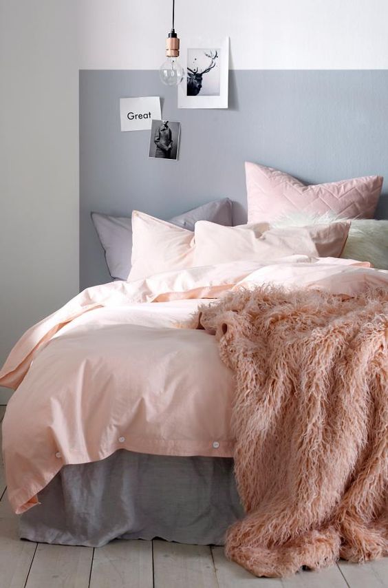
Grey and rose are perfect for bedrooms, calm and relax combination.
4. Greyish. Grey is a key staple throughout any home – it gives a room so much character and is so versatile. I use dark greys for a moody intimate feel, which instantly creates a cool adult vibe. To create maximum impact you can use accessories with colourful soft furnishings, which pop out against the inky walls. Soft powdery vintage pinks or electric pinks work great against a deep grey tone. I love using light grey to create a peaceful, calming setting and then use dusty pink as an accent colour to complement and lift the grey. It also adds some femininity to the room. Perfect for a bedroom or dressing room.
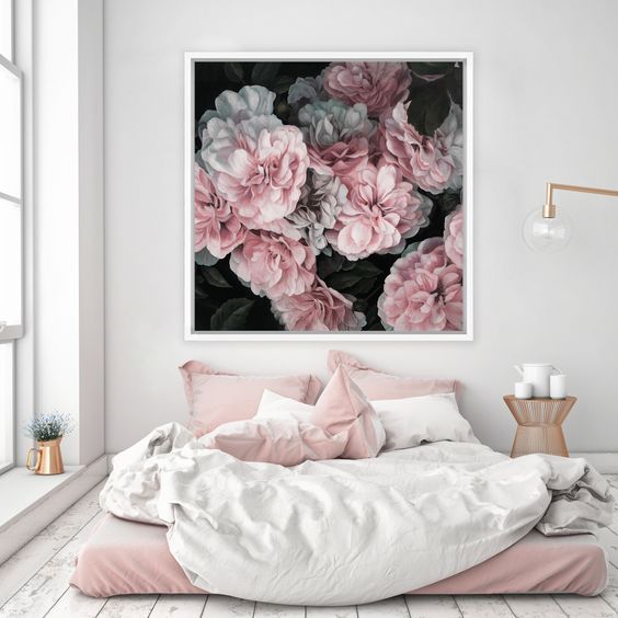
See how the picture on the wall behind calls the attention and matches the room. 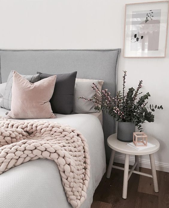
The giant tricot blanket is also a new trend for the winter. 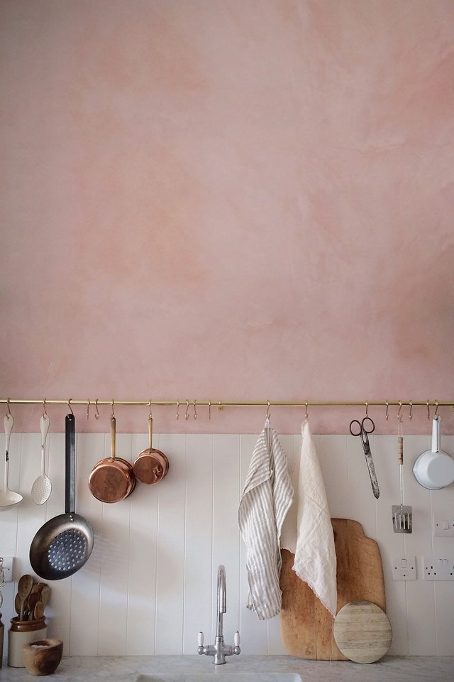
Nice minerals rose paint on the wall. 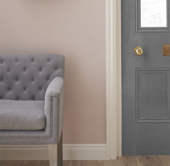
Grey and rose. 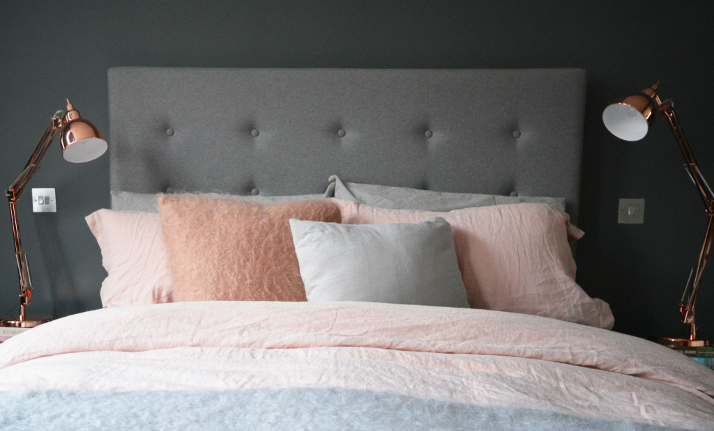
Bed clothes are easy match, you can use with copper lamps and details.
To spice up your home is not a complicated task, you can start with some complements, pillows, carpets, blankets, bed clothes, lamps… if you like the result, then you can plan a painting on the wall, or a change on the sofa fabric. Therefore, don’t choose those colours just because they are in the year palette, choose the colours that makes you feel better home. I just meant that it will be more easy to find accessories on the palette of the year.
Hope you enjoyed my tips. Have fun!!


