For people who want to breathe in that color, that is both vibrant and comfortable, chosen by Pantone@, as the 2019 color, my suggestion is that you start small. Because it is a strong and striking color, it can stand out in a classic setting, for example. Or become incredibly prevalent in contemporary surroundings.
If you already have a neutral ambiance, and just want to bring a little freshness and style to your ambiance, take a look at the photos below, and see how to give a lift in your home with just a few colorful dots.

1Just few elements are enough to bring up a neutral bedroom set. From monticellohomes.com 
Another sugestion with few elements, combined to dark green and white sheets. 
Coral here is present only in the paining, the rest is a combination of tones. From Houzz.com 
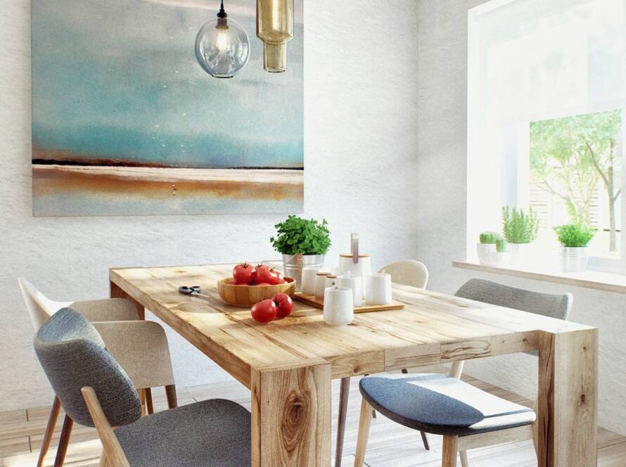
Straight coral tone, in a beautiful dining room set. From tempodadelicadeza.com.br
Coral is a combination of orange and pink, a point between two hot colors, but if well dosed, can work very well with colors like gray, black, brown and beige.

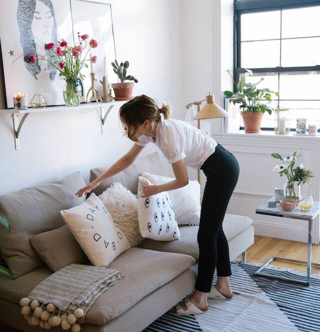
A fresh tone of coral contrasting to a dark grey elements and white sofa works very well. 
Donna Karan NY apartment, can this be more stylish?
These strong shades like coral can be used in small amounts, as pillows, walls, chairs, works of art, carpets and curtains.

Soft coral tones are perfect for a dining area. 
You can paint some shelves or doors, they will turn out to be the top feature in the room. From fashionchic.pt 
Some old furniture will get another fresh look with a painting in coral. From quartosetc.com.br


Sometimes coral color appears diluted, as being was a visual effect, a combination of two or more colors. It does not appear pure, but a sum of other tones.

The fire, the floor, the vases are not coral, but together make a perfect match. 
Beautiful match with the blue sofa. From achadosdedecoracao.blogspot.com 
Neutral colours with this beautiful coral in the wall. From simplesdecoracao.com.br
So, are you willing to dare and try to include such a cozy tone to the ambience of your home? Leave ideas and opinions in the comments below.
Have a very special week!!
All images, from Pinterest.com